Tuesday, 5 August 2014

Set One Twenty Work Opportunity


At the start of august I was approached about a freelance work opportunity for leeds based event company, Set One Twenty. I was aware of the company before this and had even been to a couple of their events. They specialise in club nights and live gigs throughout Leeds, Sheffield and Ibiza that boast the best in the latest and biggest underground deep house, techno and disco acts. Set One Twenty had been started up in 2012 and is now in its 3rd year running.


The role I was approached about was for a junior graphic designer, not much information had been given when it was mentioned but as I had previously been introduced to both the owners and founders of the company, it would not be an issue for them to get hold of me.


Thursday, 15 May 2014

PPP 2 Evaluation

Throughout this years PPP module I feel that I've learnt a lot of skills to do with networking and talking to clients. With the responsive module being closely related to this I was able to develop these skills to a very good level, especially with having clients who were not the best to say the least. The personal branding project was very beneficial for me as I felt that concept building skills were something which played a very big part in it for me and was something which I improved and developed throughout the brief.

Research skills were something which I would like to think I improved on throughout this module, especially with the group project from this module, as we all had to do some research into what we were delegated, even though my group was not as organised as we should have been , we still did a lot of research. Using alternative forms of printing such as vinyl has been something I had used in this module, which I found very helpful as it is a good way to get colours onto stock you cannot digital print onto.

Applying and keeping consistency of branding and identity across suitable media was one thing which I thought I was able to do to a good level, as I was not too sure what to use for my promotional pack and what things I should apply the branding to at first, but I eventually got it right. My Presentation skills have improved a lot throughout this module, doing the actual presentation in addition to preparation for them, as in the past I have not exactly enjoyed them, and I am now a lot more confident in doing them. Linked in with this is talking about my work, this is one thing which I think I have improved.

My main weakness with most work is my inability to manage my time well, which then means that I cant do as much as I want with the briefs or means that the quality of it is not as desired. This is one thing which I am continuously striving to improve.

Keeping up to date with blogging is probably the main thing which I need to improve as this relates to not having enough time for other parts of the briefs. 

Planning ahead is another thing which I need to improve as I always have to end up using stock and materials which are only available at LCA, when I would like to use other specialist materials.

I think being more confident and practicing presentations is another thing which I need to improve.

Attendance - 5
Punctuality - 5
Motivation - 4
Commitment - 4
Quantity - 3
Quality - 4
Contribution - 5

Wednesday, 14 May 2014

PPP Presentations - Lifes a Pitch

Here is the group presentation we had to do for the lifes a pitch brief.


Thursday, 1 May 2014

PPP Personal Branding & Promotional Pack

For my Personal branding this year I decided to start doing my research into existing logos which I liked and related to my style of work, on my design context blog.

For my Personal branding and promotional pack this year I wanted to design something which represented me as a designer and also reflected my practice within graphic design.

Before I started to design I looked back on the work I had done throughout this year in addition to work I had done outside of university.

After having reflected on my work, I had picked up on a few things which stood out from my work. 

From majority of the briefs and projects I had took on this year logotypes were one thing which I really enjoyed designing, along with branding in general, icon design and print design.

I decided to utilize these strengths, and incorporate them when designing my logo. I had started with creating some logos with my initials in styles similar to some of the logos I had seen when doing research. I hand rendered the design first.


I then went over them in pen and eventually digitally recreated them. I had simply used the pen tool on illustrator to construct the logos along with the type tool.


When it came to choosing a font for the logo I wanted something which was fairly minimal but not a font which has been overused in other logos or branding. I liked the look of the Gothic font family as it was similar to the font I had used last year in my branding, which was the Nexa.


I had played around with some of the logos, developing them from the hand drawn ones. I was still unsure which logo I was going to use but I figured that choosing a colour was something which would take a while so I started to put the logo I liked the most at the times through different colour schemes to see what worked. 


I started using a bright florescent green as I thought this was a decent representation of what people describe me as a person, loud, bright and green being my favourite colour. The only problem I realised using a colour like this was the fact that I would find it hard trying to get it reproduced through CMYK printing as I would have had to use vinyl on all the printed materials in order to keep a consistency of colour. 

This was obviously not very practical so I started to see what the closest CMYK match to that was, in addition to this I wanted to make sure that RGB of the colour was also websafe, as I was going to be using this logo across online social media platforms such as twitter, tumblr and on my portfolio on behance and my website. With this in mind it really opened my eyes to why choosing a colour is a very crucial part of designing a brand and identity.

As you can see I tried a few different greens in RGB and CMYK with gamut warning correction. I also did a grayscale of the colour to see what it would have looked like if I could not print in colour.

I left choosing the colour aside for a moment as it was going to take longer than I thought and figured it would be easier once I had chosen a logo first.

Apart from the logos being representative of my style of work I did not have much of concept behind most of them. This was when I decided to incorporate a question mark to some of the logos to represent my second name, ‘Mistry’. I quite liked this idea and I did have a logo design with a question mark in it, but did not think it would have worked at the time. After having added meaning to it I slightly altered the existing logo with the question mark, adding some geometric shapes and playing around with the partitions which create the question mark.


I ended up choosing the logo with the square around the logotype, but at a 45 degree angle. The four corners of the square represent the 4 areas of design I like to think are my speciality, Branding, Logotypes, Print and Icon design.

With a logo chosen I decided to continue choosing a colour. I did some quick research into colour theory. I started to use an orange instead of the green as it is often used to symbolism creativity, youth and is in the middle of red and yellow so it’s also used to draw attention but not alert or alarm.I tried a florescent orange but did not think it would have been suitable for the logo I chose.

I ended up choosing a deep almost warm red orange, as I liked how it almost did look red but you definitely knew it was an orange. The colour was also a websafe RGB and could be reproduced in CMYK with the gamut warning correction.


With the overall logo and identity chosen I just needed to apply it across suitable media. When it came to choosing what to apply it to I stuck to items I use, as I did not think it would have been as effective if I applied across things I did not really use. 


I had decided on using a notepad, Invoice, Letterhead and envelope along with my CV.

I had kept the design of the invoice fairly similar to the one I had done last year for my personal branding along with my letterhead. 


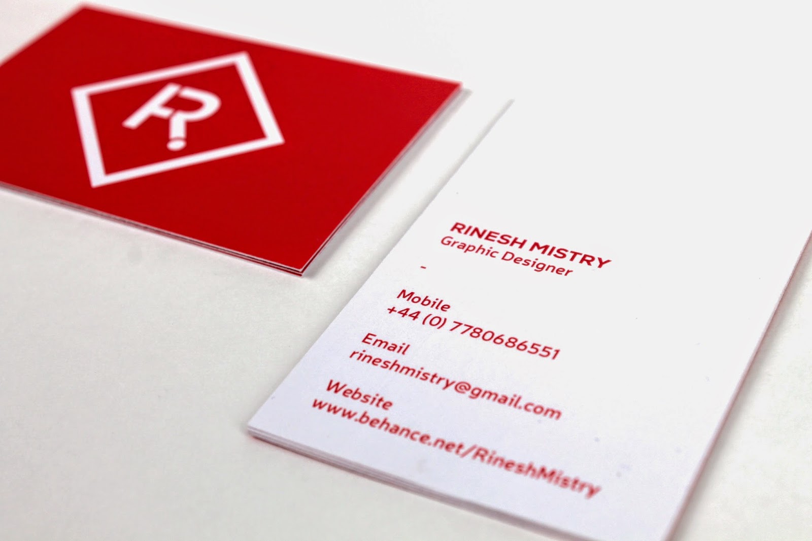
For the business cards I had tried a few different layouts as I was not too sure how I wanted it, apart from having a logo on one side and details on the other.


After having experiment with a few different layouts I settled for this one:


For my creative CV I wanted something which was in line with work I had done in the past. I had thought of a few different ideas, but due to not having a lot of time I quickly decided on doing a folder poster which would have my details on one side with examples of my work on the other.

I had decided to use a similar layout to the posters I had design for the Design for print module as I was going to folding the poster in a similar way.


I only wanted to include information that clients would want to see, which was design skills, previous education and qualifications and example of work and clients I had worked with. I also included a short paragraph which I thought summed me up.


I kept the layout of the back side of the poster in line with the folds so that its easy for the person to read and view. I included examples of work I had done throughout the years at LCA.

For items I could not print onto I used vinyl which was the same colour to apply my branding to. These items were the envelopes and the notepad, I also used it on the poster in the corner.


For the website I wanted something which was simple and was easy for the user to get to all the crucial bits of information. I did some quick research into existing portfolio websites to get an idea of what was already out there.

Due to leaving things quite late I had to go straight into designing the wireframe on InDesign.

I used the guides as a grid to ensure a consistent layout of the website. I began by adding the logo, which would double as a homepage button and a nav bar.

Keeping to this grid I designed the rest of the page and how the photos will go on them along with the other pages.


These were the final images of my identity/ personal branding.


Thursday, 24 October 2013

PPP2 Task 1

For our set task by John we had to answer the following questions -

Reflecting on your Summer what is your most memorable event and why? 

This summer just gone I would say that the most memorable event I would say was my holiday to portugal, not only because it was a hoilday but just to see some different scenery was good. I had went with family to Albufeira and also visited Lisbon for a day which I really thought was amazing.

Have you made any contacts over the Summer that you feel could be helpful over the coming year or so and what outcomes did you feel you achieved?

How did you meet/contact these contacts (methods used or how it happened)? 

I did make some contacts this summer, mainly for corporate design work such as brochures, booklets and some poster design work. I had come across these contact through a friends business as owns a small social media and marketing company. I feel as though a lot of what I learnt in first year in terms of colour modes, Indesign tutorials and quite a lot of stuff really helped, but I think that due to the nature of what the job was I learnt how to work with other design creatives and how you would evidently be working if you was to design a booklet or as part of a studio; as I had to go to the place which we would be promoting though this booklet with the photographer and help direct the shots as I had a draft of the booklet already designed.

What methods of contacting creatives can you think of and what would you ask?

I have been thinking of contacting and hopefuly visiting a few design studios in Leeds such as Analogue, but apart from that I have not really been looking into any back at home in Leicester or possibly London.


Saturday, 19 October 2013

PPP 2 - 10 things from Level 4

This was the list I had made last year at the start of the course:


5 Thing I want to learn during this programme:

1)        Money – the monetary & business side of being a graphic designer as this is one of the things that you would be taught how to do so in the second year.

I think that I managed to work my way around how and where to use my money throughout the year but did find it hard at times as I was new to having to pay for printing all the time and methods of print and production, but would say that this year I am aware of this.

2)        New techniques – new methods and forms of print, as it is an area I would love to explore more.

I definitely think that I made use of LCA's facilities and trying new methods and techniques of production, such as spot varnishing, letter press, screenpriniting.

3)        How to protect work – again linking back to the business side of things, how to copyright and protect intellect property.

This is one of the things which we are still to learn which I think we will look more into this year.

4)        New ways of using type – the theory and basics of using typography.

The first few months where a lot of the work we were doing was to do with typography which I thought was fundamental as I had learnt the basics and some advance things about how type works and the technical side of it, such as when we had to cut up and make new fonts.

5)        The fundamentals of Graphic Design – the ins and outs of graphic design.

This one thinking about it now will be ongoing as there is still so much theory that we have not done yet, but I obviously now have much more of an insight into graphic design than I did before LCA.

5 things I want to improve during this Programme:

1)        Time management

Like I had said with money, this is another thing which I am more aware of managing this year, but am definitely better at doing than I was before I had started the course.

2)        Spelling/Academic Writing

I think that the Context of Practice module helped my develop my academic writing skills especially with things such as Harvard referencing and what tense to use when writing an essay.

3)        Compositional Skills/Layout

This was one of the things which I had trouble with last year but was very interesting and crucial to learn as it was a lot more complex than I would have thought.

4)        Adobe Illustrator Skills

The creative workshops helped me to improve my skills in all graphic design software, the sessions were really good as they went over simple things which really change how you would use design software.

5)        Use of Typography

Like I had previously said the first few months and projects were fundamental in helping me improve my use of type.


Friday, 4 October 2013

10 Successes for Level 5

We had to make a list of 10 successes we wished to achieve by the end of second year on BAGD.


  1. Professionalism - to achieve a higher level of final produced outcome.
  2. Further Experiment with production - try out and improve on print processes, binding methods, etc.
  3. Collaborative projects - to do something during a brief with a student from another course or different year on BAGD.
  4. Photography of work - professionally take photos of work and final outcomes (industry standard)
  5. Blogging - to properly blog and do it when we get work set
  6. Time management - properly manage and prioritize my free time
  7. Leave enough time for production - something I learnt that you need to give time for as you will always come across problems with production.
  8. Development - developing work to a higher level, push any idea to its limit
  9. Taking better notes - more detailed notes from sessions, lectures, seminars etc.
  10. Presentation skills - talking with more confidence, how I present the work, how I talk about it, etc.