Straight away I knew that I wanted to do something which had an element of screen printing and packaging as I would say that they would be 2 of the things from first year which I have enjoyed getting into and experimenting with.
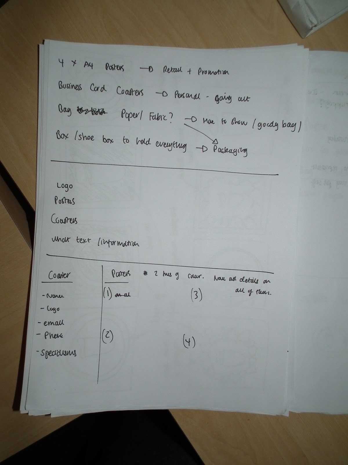
I started off by thinking of a promotional pack and what could go in it.

I then started to come up with rough ideas of logos and what sort of design I would go for,


Once I had decided what I was going to be making I started to do some rough visuals and thumbnails. I had also started to think about how I was going to be relating everything to me as a person, as I wanted to make sure that the design was evidently mine. Some things which I definitely considered was the use of bright and garish colours which I thought reflected my personality and my dress sense as I'd say that I wear bright coloured clothes. I also wanted to reflect through this brief most aspects of my life and what I enjoy.


I had come up with the idea to do a set of 4 posters, which would be square as I did not want to use A format, and I thought that square worked to reflect how I am a short person. For one of the posters I wanted to have a compilation of my design tools.

I then made a bit of a plan of how and what I was going to be producing.

For my business cards I was planning to create coasters which would have been the business cards, as I thought it would have been a good way to express and show how I do enjoy a drink now and again.

For a lot of my designs I looked at various different types of business cards. I initially wanted to do something with the lazer cutter but did not end up getting a tutorial to use it in time.


Screen printing was another method I wanted to use for the cards.


Edge painting the cards was another thing which I wanted to do as in design I always have paid more attention to the little details and finishing techniques and I wanted this to show through.

This card linked in well with how I wanted to make a compilation of my design tools.

I liked in this one how they had used block shapes behind the text to add some colour, I also though that it made all of the words that were in front of it stand out more.
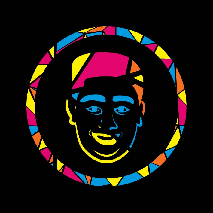
I then started to look at logo and icon design as I wanted to create a small logo for myself. I had initially thought of using a drawing of my face as it would be simple and would express my playful personality, I also think that this would work well with how I had already chosen to use a Sans Serif font, which I had chosen because I thought that it shown how I can be blunt and straight to the point at times.


I started to trace photos of my face to get a frame to work with.


Having had a rough Idea as to what the logo was going to be I did some designs for the back of the business cards.

having a look at what sort of design I wanted to with geometric shapes.


I scanned in one of the drawings and started to play about on Illustrator with layouts and shapes.

I had made a pattern which I was going to use of the bag and cards.


I started to play around with the pattern and logo visuals.


With a design in mind and knowing what I was going to make I ended up with the final designs of everything.

Bag

Pattern for inside of box, tissue paper for bag and inside of bag.


Coaster business card back and front.

Box


Posters
I came across a few issues when I was screen printing my cards, and pattern, as I had not been used to coating the screens myself I put too much on the screens and it ended up washing off the screen when I washed off the exposed image.


This meant that I could not do as many as I planned to at once, but I simply just got one of the technicians to coat it for me after I washed the screen.
I decided to go with Foiling for the posters as I think that it emphasises my interest in finishing techniques.
I started to experiment with what sorts of stock the heat press would work with the foil.


as you can see here it did not work as well with the thicker stock, such as cartridge and watercolour paper.


But I found a decent stock which was thicker than normal stock. Here are my final outcomes.


I would like to think that every design decision I made on this brief was made to reflect a certain aspect of my life, personality, design preferences and design interests. Overall I was really happy with the end outcomes, despite the box being too small to hold the posters.